Tasmanian Timber used to create refined comfort at MAP Architecture
As they say, first impressions are everything. And for one of Melbourne’s up and coming architecture firms, MAP Architecture, creating and designing a new office space that allowed clients to gain a sense of their thoughtful and refined architectural style was a must.
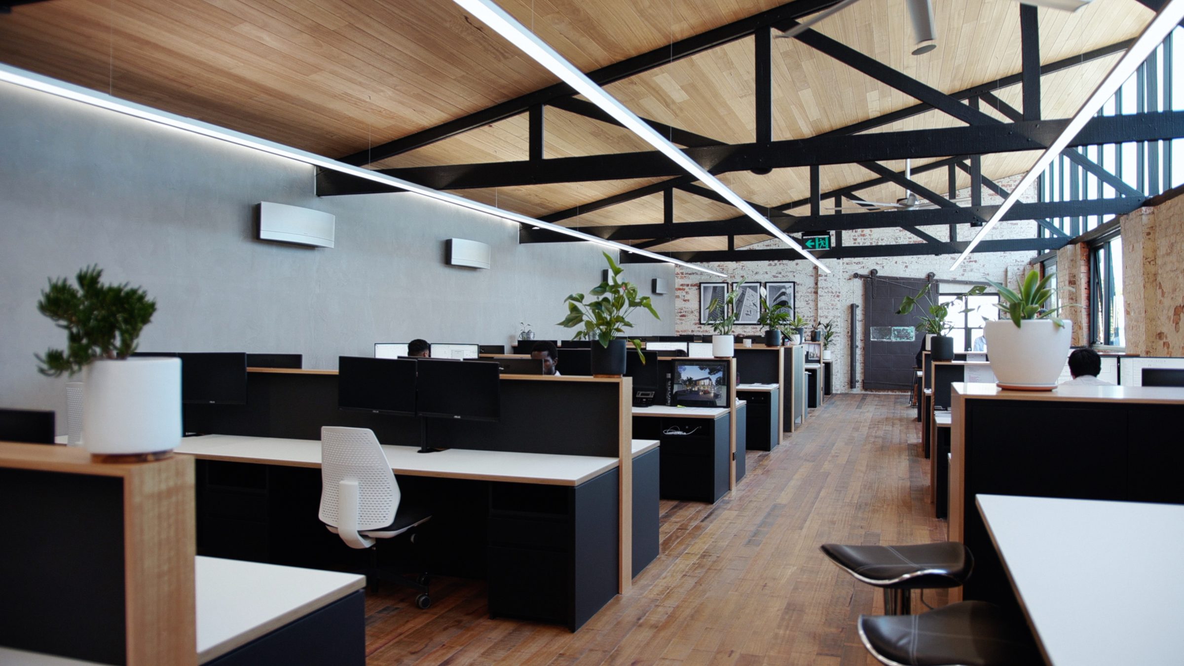
Included in their own design brief was to create a modern yet warm office space, leaving the traditional sterile and closed office cubicle behind. To assist in pulling off this look the choice to incorporate Tasmanian Timber throughout the space was a given.
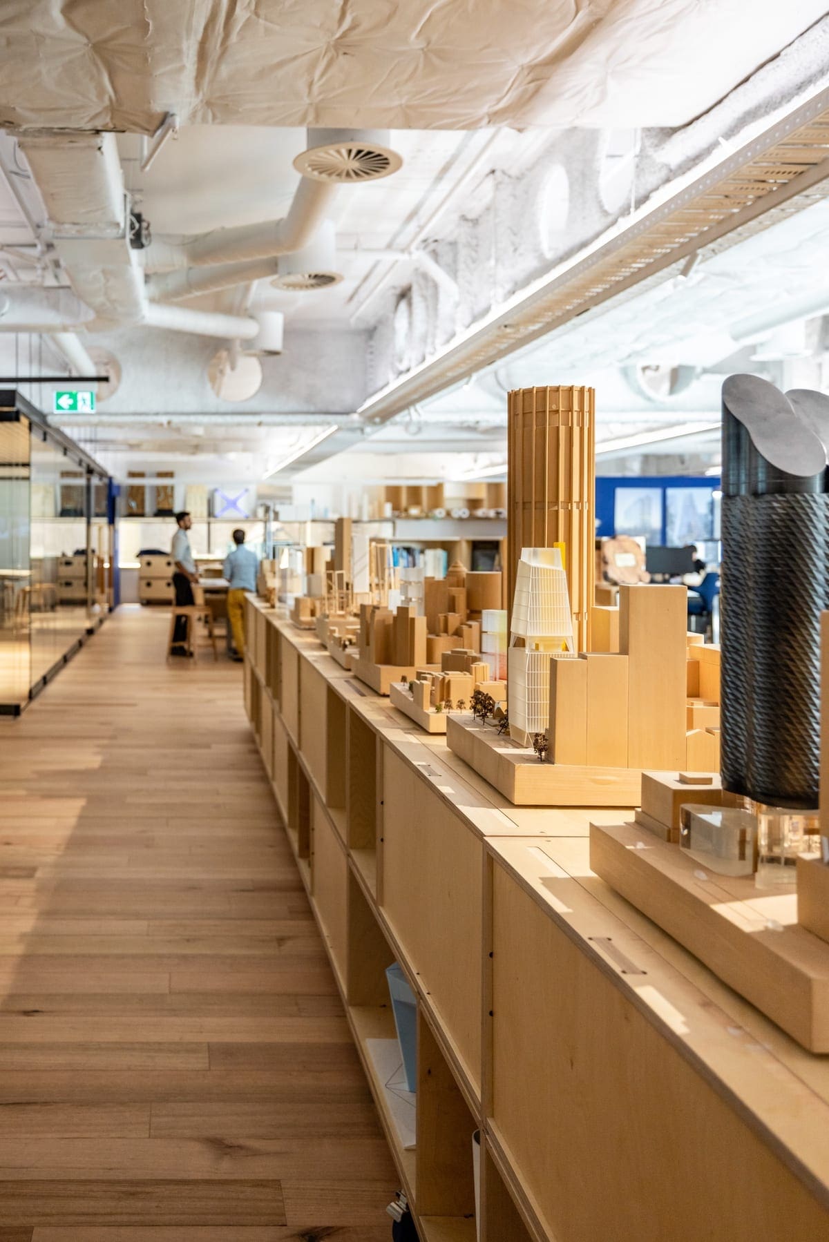
“Our aim was to create a space where when guests walked in, it was obvious through the design that we are architects. Our office is a tangible display of our work. It’s always nice to see that immediate positive response people have when they first walk in,” explains MAP Architecture’s Creative Director, Renato Picciani.
Old meets new
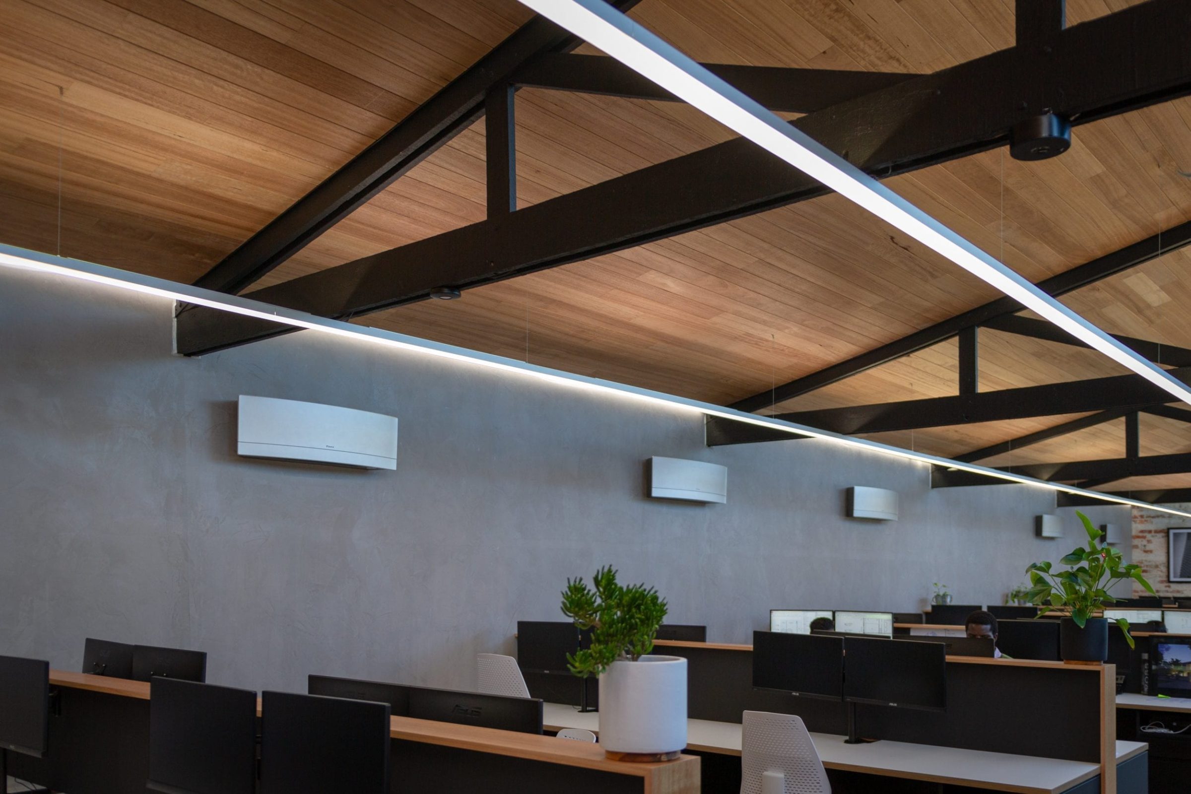
Behind the office design revamp, Picciani and team had the office gutted, completing the new fit-out in twelve weeks. Playing with the space’s existing features including the ramp shaped ceiling, and exposed brick walls, the team combined old features with new and innovative material applications.
While new materials were introduced, using character-rich rough sawn Tasmanian Oak across the floors gave the space a comfortable yet refined feel.
“The rough sawn Tasmanian Oak floors were effectively straight off of the bandsaw. It’s a beautiful and interesting look because you get all sorts of patterns through it and the strapping marks of where they’ve stacked it. It was just what we wanted, something natural and textured.”
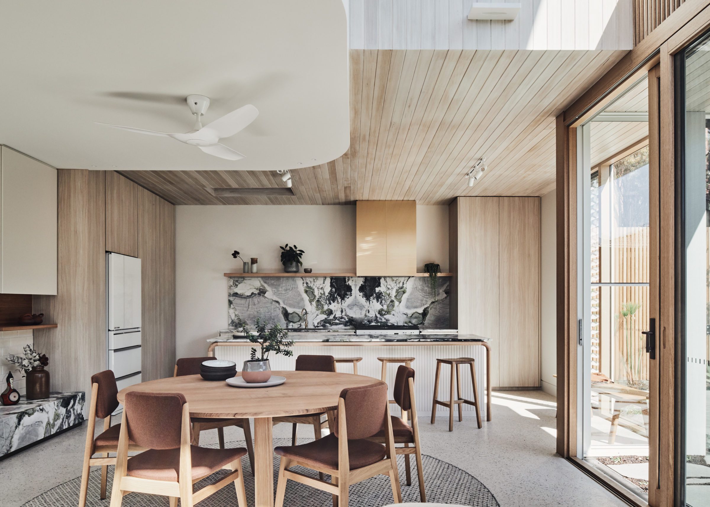
Opposite the rough sawn floors, the ceiling is also lined with Tasmanian Oak, echoing those same warm tones.
“The Tasmanian Oak ceilings were dressed up a bit with a groove edge that brings more depth and visual appeal. It’s a great contrast to the floors, giving off a more polished look even though it’s completely in a natural and untouched state.
“We didn’t put any coating on the ceiling to allow the oak a chance breath and naturally age.”
A beautiful collision of aesthetics and sustainability
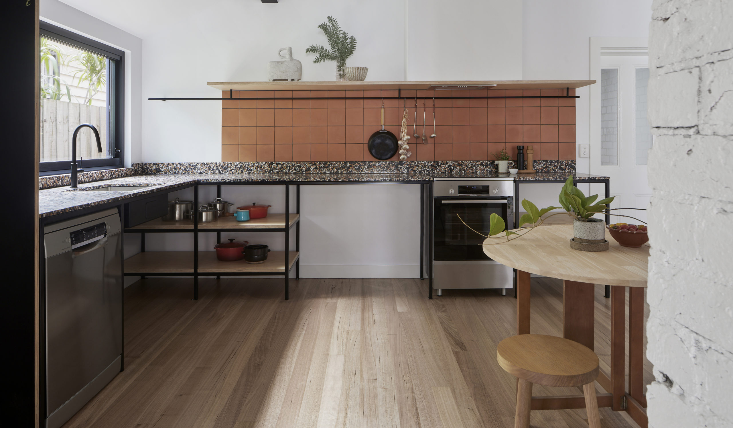
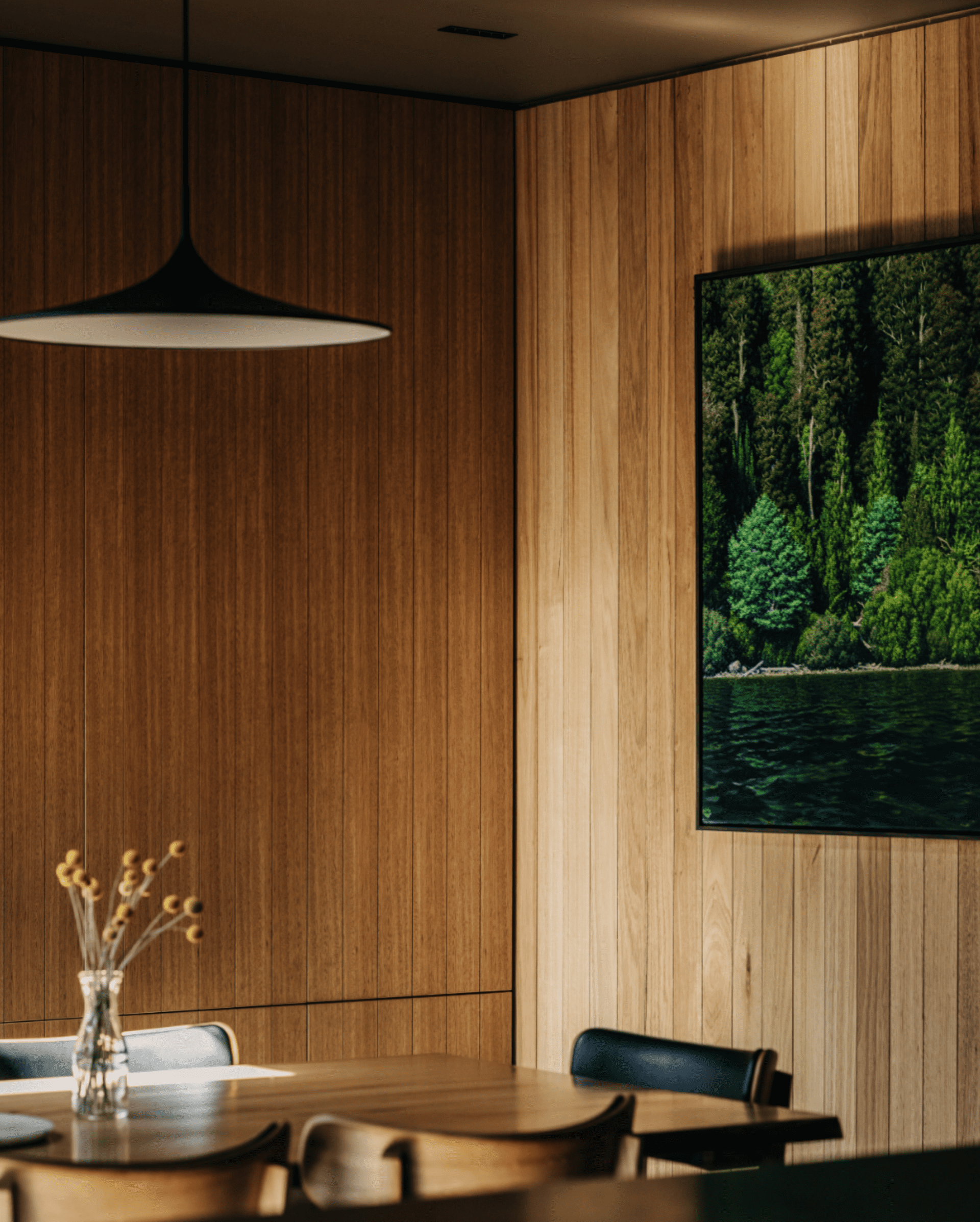
Tasmanian Oak was also chosen for other applications throughout the office including shelving, desks, panelling and veneer cupboards and drawers in the office kitchen. The inviting effect of the timber helped achieve the refined yet comfortable ambience they were looking to achieve.
With aesthetics aside, sustainability was also of importance to the MAP Architecture team.
“The sustainability of materials and projects is of great importance to us in our designs. We were conscious of our material choice across this project, attempting to reduce our footprint as much as possible.
“It doesn’t make sense to choose a timber that has to be transported from far away, especially when there is so much beautiful timber already here in Australia. It really came down to a matter of heritage and pride and Tasmanian Timber fit that requirement.”


